Analytics Panel: Distribution Charts and Data Clarity
 I covered the analytics panel in a previous post, walking through how to use it for trend comparisons, percent-change normalization, and overlaying multiple regions on a single timeline. That post covers the fundamentals and is worth reading first if you haven't already. This post is about two specific additions that address gaps I kept running into during my own analysis.
The Distribution Chart
 The analytics panel has always been good at showing you how a metric changes over time. But it didn't answer a different question: how is this metric distributed right now, across all regions at my current granularity?
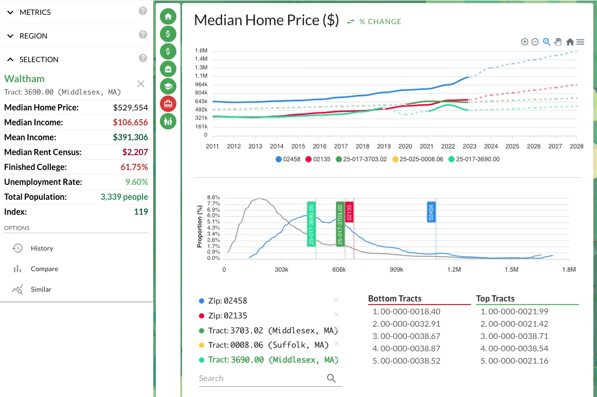
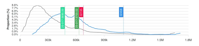
That question matters more than it sounds. Knowing that the median home price in a metro is $300K tells you almost nothing in isolation. What you need to know is whether that $300K is in a tight cluster or a wide spread. If 80% of the tracts in a metro fall between $280K and $320K, you're looking at a uniform market where location within the metro barely affects price. If the range is $150K to $600K, there are pockets of opportunity and risk hiding inside the same metro label. The distribution chart is a histogram that makes this visible at a glance.
I started using the distribution chart as a sanity check before diving into individual neighborhoods. If a metro has a tight distribution on home prices but a wide spread on crime, that tells me price isn't reflecting safety differences yet. Either crime data is lagging behind price adjustments, or there's a genuine arbitrage opportunity: neighborhoods with similar prices but very different risk profiles. Either way, it's information I wouldn't have without seeing the shape of the distribution.
The distribution chart also reveals outliers. If you're looking at a tract that shows up as a top scorer in your formula but sits at the extreme tail of the price distribution, that's worth investigating. Extreme outliers in census data can indicate data quality issues, a tract with unusual boundaries, or a genuinely anomalous pocket. In all three cases, you want to know about it before you wire earnest money.
Dashed Lines: Actual vs. Projected Data
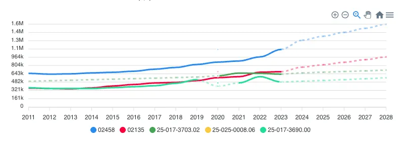 The second addition is visual: solid lines now represent actual census and survey data. Dashed lines represent model projections and extrapolations.
This sounds minor. It's not. When you're looking at a trend chart that extends to 2025 and the last hard data point was the 2020 census (or a 2022 ACS estimate), everything after that line is a forecast. The old analytics panel didn't distinguish between the two. You'd see a smooth line trending upward and naturally assume the trend was established, when in reality the last three years of that line were statistical projections based on earlier data.
For hold-period modeling, this distinction is critical. If your 5-year exit strategy depends on population growth continuing at 3% annually, you need to know whether that 3% comes from a decade of observed data or from a projection model extending two years of observations. The first is evidence. The second is a hypothesis. Both might turn out to be correct, but they carry different levels of confidence, and your underwriting should reflect that.
I've made it a habit to check where the solid-to-dashed transition falls relative to my decision-making data. If the trend only looks good in projected territory, I discount it. Projections based on strong historical patterns deserve more weight than projections based on a couple data points during an unusual period (like a pandemic-driven migration surge). The visual distinction makes this check instant rather than something I have to mentally track.
Using Both Together
The distribution chart and dashed-line distinction work well as a pair. If the distribution shows a metric is tightly clustered and the trend line is solid through your analysis period, you have high-confidence data. If the distribution is wide and the trend line goes dashed right after an inflection point, your confidence should be lower. Calibrating how much weight to put on any given metric is half the work in real estate analysis. These two features make that calibration faster.
