Improved Category Visuals
 As some may have already noticed, we recently added filters to our metrics. The filter appears when hovering over the pill corresponding to the metric in map view (under
 Heatmap Metrics section). When using the filter on ranked metrics, it works as a threshold, cutting off all zipcodes that don't pass the filter criteria. The 2nd type of filter (which appears when you hover over a blue/categorical metric) is for disabling certain categories. This process then allows you to limit the selection to 2 categories to obtain a more granular comparison between them.
However, until recently, I found the map to be lacking in its ability to represent this granularity. The regular approach works well for large number of categories, but when comparing only 2 categories, binary approach hides a lot of data. Look at the gender distribution of New Hampshire, for example.
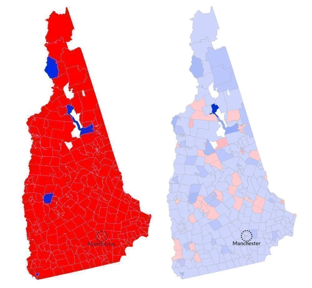
The original map on the left makes it look like New Hampshire gender ratios are a bit out of whack, with women banishing men out of most zipcodes. The picture on the right, however, is the new logic showing the reality. We can see that majority of the zipcodes are pretty close to evenly distributed (we can tell this from light colors, almost close to neutral), and even have slightly higher number of males than females. The reason for skewed representation in the original image is because of Bretton Woods, the dark blue zipcode on the map that's 96% male (for whatever reason).
The old logic chooses winning category based on the average. Bretton Woods skews the average for male ratio upward, causing all zipcodes with male ratio lower than the average to be reclassified as mainly female, even though the male ratio in those zipcodes is still higher than female.
The new logic, which I've internally been referring to as the "versus-mode", kicks in when the number of categories being compared is exactly 2, and allows us to compare 2 specific categories much more pricesly. By looking at the new map, we can now see that the male/female ratio in most zipcodes is actually pretty close to 50%. Similarly, the outliers (like Bretton Woods) now stand out better than in the old logic, and make it easier to understand what is actually going on with the results.
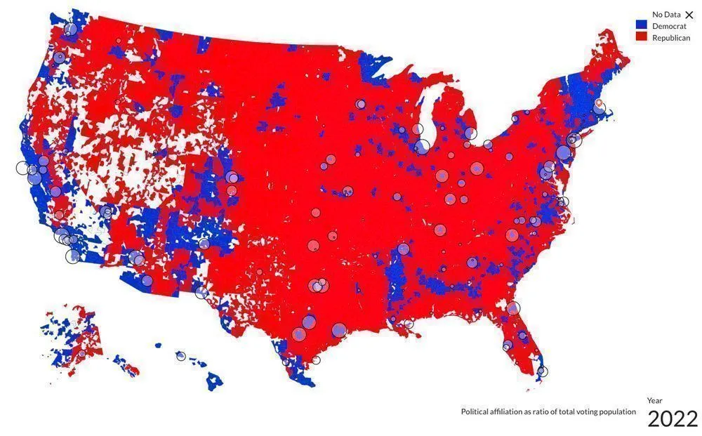
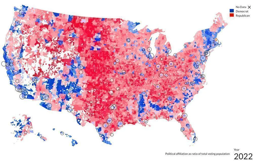
The political affiliation map, which looks at strength of democrat vs republican affiliation per zipcode, benefits from this change as well. The original map is shown below, with newer version right below it. I hope you enjoy this enhancement.