Investomation Architecture
Why Making Accurate Chloropleths is Hard
There are plenty of chloropleths online showing any metric you can think of, from election results to demographics. The problem is they either focus on US as a whole and are crude (good enough to see state-level trends, but not those of individual neighborhoods) or they only focus on a specific region/city. They don't scale, and if you try to stitch together data from multiple sources, you'll notice it often doesn't match up.
There are a ton of nuances when normalizing data, and different agencies use different normalization techniques. This is especially apparent when comparing data from different cities, since cities use different methodologies to gather and present their data. Even the agencies tracking this data have been running into this issue. For example, police departments have been voluntarily submitting local crime data to the FBI since the 60s, yet to this day we still don't have an accurate crime data representation from the FBI because the metrics submitted by individual police departments are not consistent. Police departments track crimes differently, and they report them differently.
To make things even more complicated, the regions themselves are not consistent. Some data is measured in terms of zip codes, other data in terms of tracts, and information like school district and voting data use their own region boundaries. The data is there, but it's a mess and organizing it yourself is a full-time job, especially when you focus on multiple markets.
Where the Data Comes In
Investomation pulls from four main types of sources: spreadsheets (government agencies, real-estate platforms, Census), APIs, other chloropleths and heatmaps (which we can sample by reading colors off the image), and web-scraping (for data that exists online but isn't published in a structured format). All of it gets curated and cross-verified before it ever reaches our database, because even Census publishes bad data sometimes that takes them months to detect and fix. Our curation logic looks for outliers and compares values against related metrics to see if they pass a sanity check.
Spreadsheets and APIs are the easiest to feed in, but the data still has to be cross-verified against existing data. Web-scraped data tends to be more up-to-date but is often full of bad values that have to be filtered and normalized before it meets our standards. Chloropleth sampling is less precise than the other two but turns out to be a useful third opinion when we're cross-verifying numbers between sources.
But the hard problem isn't ingestion. It's what to do with the data once it's clean: how to estimate the values that aren't in any source, project trends forward, and reconcile inconsistent region boundaries.
The Architectural Shift: From Just-in-Time to Precomputed
The first version of Investomation did most of its computation in the browser. When a user opened a map, the frontend would pull raw data from our API, run estimation logic on the client side, and render the heatmap colors based on the results. The advantage of this approach was simplicity: every page load got the freshest possible computation against the latest data. The disadvantage was that every page load also had to wait for that computation to finish.
This worked when the logic was simple, but it stopped scaling once we wanted to do anything sophisticated. Estimating values for under-represented areas, normalizing across inconsistent region boundaries, projecting trends forward in time, each of these required computation that the browser could not afford to do at request time without making the user wait several seconds for each map view. The runtime budget on the frontend was the ceiling on how much logic we could apply.
The fix was to flip the architecture: move the heavy estimation out of the browser and into precomputed backend tables. Ingest the raw data once, run all the estimation logic against it once, and store the result. The frontend's job becomes a simple lookup. The trade-off is space for time, which has been a settled trade-off in software for years; storage is cheap and getting cheaper, while user attention is expensive and getting more expensive.
This change looks small on the surface but it changes what's possible at the design level. With the runtime budget no longer a constraint, we are no longer choosing between "accurate" and "fast". We can apply as much logic as the data justifies, store the result, and serve it instantly to anyone who asks for it.
Stacking Layers
Once we don't have to choose between accurate and fast, we can keep adding logic without paying for it at request time. We organised our logic into a stack of independent layers, each of them shaped the same way. This allowed us to stitch together an arbitrary number of layers like Lego blocks, each with a unique purpose and unique approach.
A single layer looks like this:
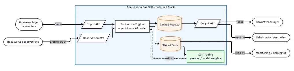
Three APIs sit at the boundary. The Input API takes whatever the previous layer (or raw data) hands over. The Output API hands its result on to whoever asks: the next layer, an external integration, or anyone who wants to read directly. The Observation API takes ground-truth data when it arrives later, which lets the layer compare what it predicted against what actually happened.
Inside the block, the estimation engine does the work, and its output goes into cached results that the output API serves. The engine itself can be anything that respects the API contract: a one-line formula for population density (population divided by area), a multi-pass statistical model for demographic infill, or a full neural network for the harder pattern-matching problems where conventional algorithms can't compete. The output API and the stored error don't care which kind of engine is inside.
Along with each prediction, the engine writes an entry into stored error, which is the layer's record of where it's been wrong. That record feeds self-tuning, which adjusts the engine's parameters or weights over time. The block stays accountable to itself, and the rest of the system depends on the output API contract without knowing or caring how the engine learns.
The whole pipeline is N of these blocks stacked together. The Granularity layer might be a deterministic remapping today and a learned mapping tomorrow; the Infill layer might start as nearest-neighbor estimation and graduate to a neural network as we accumulate training data. We swap one block out for another without rebuilding the rest. That's the design contract; everything else is implementation choice.
This is also what gets us out of the trap most analytics tools fall into. Other platforms run a monolithic pipeline: raw data goes in, a single big computation runs, a final number comes out, and if anything is wrong the only way to debug it is to re-run the whole thing. With a stack of independent layers, we have N intermediate checkpoints, each with its own stored error and each independently replaceable. Every other property of the system, from error tracking to self-improvement to swappability, depends on this one design choice.
The Self-improvement Loop
The self-tuning loop inside a single block is only half the story. The bigger payoff is that the whole stack gets self-improving too, because every layer's stored error becomes data we can learn from.
A concrete example: crime data. The obvious starting source is the FBI's National Incident-Based Reporting System, which aggregates what police departments self-report. We started there. Our Observation API began showing systematic disagreement between NIBRS estimates and CDC homicide data (which comes from death certificates, not police). The disagreement wasn't random. Police have institutional incentives to underreport, and NIBRS violent crime correlates with CDC homicide at only r=0.34. So we swapped the engine inside the crime block. CDC homicide is now the primary violent-crime signal, NIBRS handles property crime where the incentives don't apply, and a tract-level vulnerability index distributes county data down to neighborhoods. The output API contract didn't change, downstream layers didn't know anything had moved, and accuracy went up.
Rent data went through a similar feedback loop. Census ACS reports a median rent, but caps it at $3,500. In expensive metros, that cap turns into a systematic undercount of 30-50%. We had no way to see that until we started cross-checking against Zillow's ZORI series and HUD's Small Area Fair Market Rents. The error pattern was obvious once we looked: any zip where Census reported exactly $3,500 was capped, not accurate. The Rent block now blends four sources with confidence weighting, drops capped Census values from the blend, and tracks how much of each estimate is supported by how much underlying data.
These are the kinds of corrections that a monolithic pipeline can't make. When everything is one big calculation, you can see that the final number is wrong, but you can't tell whether the problem is in the data source, the granularity translation, the trend projection, or the aggregation logic. With a layered architecture, the error is stored in the specific block where it happened, which makes it possible to iterate on individual layers without rebuilding the rest.
Why This Is Uniquely Accurate
Most analytics tools fall into one of two buckets. The first is national platforms with consistent methodology but coarse granularity, like Census or FRED. The second is local platforms with deep coverage but narrow geography, like Redfin in metro areas or a niche county-property service. The reason these are the two buckets is that doing both at once is expensive. You either invest in a single consistent pipeline that runs everywhere (and accept that you can only afford simple logic) or you invest in deep market-specific knowledge in one place (and accept that you can't generalize).
The architecture above is the bet that the two don't have to be a forced choice, but only if you make a structural commitment to layered precomputation up front. Once the layer stack exists, adding a new metric is days of work instead of months. Improving an existing metric is a per-layer change, not a pipeline rebuild. Cross-checking against a new source is what the Observation API was designed for.
We don't know of another platform doing this consistently at neighborhood granularity across the whole country. The components are not secret: precomputed materialized views, layered computation, per-layer error tracking, swappable backends. Anyone could build it. The thing that's hard to replicate is the accumulated per-layer error history, which is what's been training the self-tuning for years. That history is the moat. The architecture is what made the moat possible to dig.
