From Metric Stacks to Investment Formulas
 When I first built the heatmap scoring system, it was simple. You picked the metrics that mattered to you, toggled each one positive or negative, and the system applied hardcoded weights. High income? Positive. High crime? Negative. The map lit up accordingly. It worked for basic screening: "show me areas where good things are high and bad things are low." But that's about as far as it went.
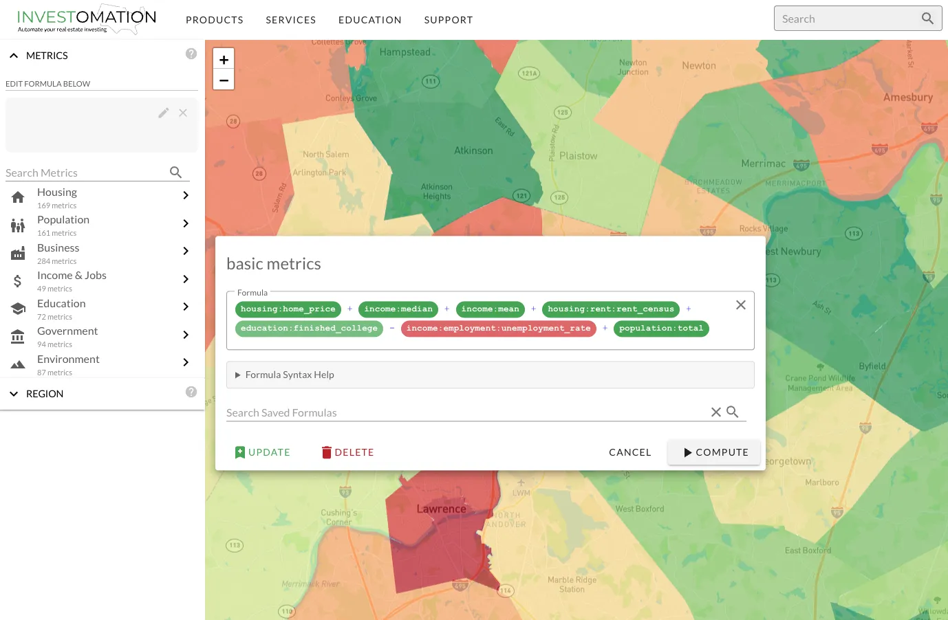
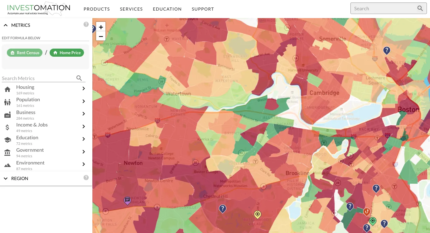
The problem became obvious the first time I tried to screen for the 2% rule. I needed the relationship between rent and price, not just whether rent was high or whether price was low. A neighborhood with $2,000 rents and $80,000 homes is a completely different investment than one with $2,000 rents and $400,000 homes, but the old system scored them the same on the rent metric. I couldn't express "rent divided by price" because the system didn't understand division. It only understood "more is better" or "less is better."
So I rebuilt it. The new formula editor treats every metric as a variable in a user-defined equation. If you just select metrics from the menu without touching the formula, you get the same familiar stack behavior through sane defaults. Nothing breaks for existing users. But if you open the formula editor, you can write actual expressions.
What You Can Do Now
Ratios and Relationships
The most immediately useful capability is division. rent / price gives you the rent-to-price ratio directly on the heatmap. home_price / household_income shows affordability ratios across every region at your current granularity. These are calculations that investors do constantly, but until now required exporting data to a spreadsheet, running the math, and then trying to map the results back to geography. Now it's one expression and the map updates in real time.
This isn't limited to two variables. You can combine as many metrics as the formula requires. Want to weight rent-to-price at 60% and income growth at 40%? Write it as an expression. Want to penalize areas where crime exceeds a threshold? Add a conditional. The formula language is designed to be readable without being a programming language. If you can write a spreadsheet formula, you can write a heatmap formula.
Temporal Comparisons
Every metric supports temporal references. population[-5] pulls the population value from 5 years ago for each region. This means population / population[-5] gives you a 5-year growth rate across the entire map in a single expression. population / population[-10] gives you the decade view. You can screen for markets that grew 20%+ over a decade without leaving the map or opening a single spreadsheet.
This works for any metric. median_rent / median_rent[-3] shows you 3-year rent growth. home_value / home_value[-5] shows you where prices are climbing fastest. The temporal syntax turns every metric into a trend metric automatically.
Conditional Filtering
The where clause lets you exclude regions before scoring. This solves a problem that plagued the old system: rural tracts with 200 people showing up as top results because they had low crime and cheap housing. Adding where population > 10000 eliminates noise from regions that don't have enough people to support a rental market. You can stack multiple conditions. where population > 5000 and median_rent > 800 focuses on areas that actually have a functioning rental market before applying your scoring formula.
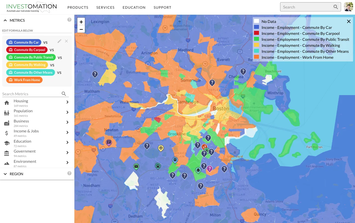
VS Mode
VS mode splits the map into a side-by-side comparison of two formulas. This is useful when you're weighing competing strategies. Put a cash flow formula on one side and an appreciation formula on the other. The map shows you where each strategy wins. Markets that score high on both sides deserve a closer look. Markets that only score on one side tell you something about their character.
Practical Use Cases
The 2% Rule at Scale
Every real estate investor knows the 2% rule: monthly rent should be at least 2% of the purchase price. rent / price >= 0.02 highlights every region where this holds. On a national map, you can see at a glance which metros and which neighborhoods within those metros still pencil out under this heuristic. The map makes it immediately obvious that the 2% rule is a regional phenomenon, concentrated in specific markets, not a universal benchmark.
Affordability Screening
home_price / household_income reveals the affordability ratio across any region. Areas where this ratio exceeds 5x or 6x are priced beyond what local incomes support, which means either outside money is flowing in (investors, remote workers) or prices are stretched and vulnerable to correction. Areas where the ratio is 2x to 3x suggest housing is still reasonably priced relative to local earnings. This is one of the most fundamental metrics in real estate analysis and it took one line to express.
Gentrification Detection
Gentrification follows a recognizable pattern: rising home values, increasing educational attainment, shifting age demographics, growing household income, all happening simultaneously in a previously undervalued area. With the formula editor, you can combine these signals into a single composite score and map it across an entire metro. I wrote about gentrification patterns in a previous post. The formula editor is what makes that kind of multi-signal analysis possible at scale rather than neighborhood by neighborhood.
Population Growth Rates
population / population[-10] on a national map shows you which metros are gaining residents and which are losing them. Layer in median_age and household_income deltas and you can see not just where people are moving, but what kind of people are moving there. A metro gaining young, high-income residents is a different investment than one gaining retirees, even if the raw population growth looks identical.
Modeling More Advanced Relationships
The old scoring system answered one question: "is this metric high or low here?" The formula editor answers a fundamentally different question: "does this place match my investment thesis?" Those are not the same thing. The first is a data lookup. The second is an analysis.
Every investor has a thesis, whether they've articulated it or not. Some chase cash flow. Some chase appreciation. Some look for distressed markets on the verge of a turnaround. Some want stable, boring B-class neighborhoods with predictable returns. The formula editor lets you encode whatever your thesis is into an expression and then point it at any geography in the country. Instead of looking at pre-built metrics and hoping they align with your strategy, you define what you're looking for and the map shows you where it exists. The heatmap is now a programmable analysis platform.
