Historical Metrics Turn Snapshots Into Trends
 I've looked at hundreds of deals where the numbers made sense on paper. Good rent-to-price ratio, low crime, growing population. Everything checked out in the present tense. What I couldn't see from a snapshot was the trajectory. A neighborhood with a $200K median home price could be three completely different investments depending on where that number came from: a stagnant market that's been flat for 15 years, a declining market that was $300K a decade ago, or a rising market that was $120K five years ago. The snapshot looks identical. The investment case is not.
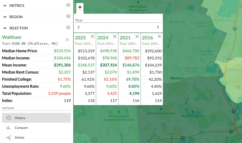
Metrics History puts trajectory on the same screen as everything else. Select any region and you get a side-by-side view of that region's metrics across multiple years. The default columns show current-1, current-2, current-5, and current-10 years. You can add any year back to 1990 if you need deeper historical context.
Color-Coded Change Detection
Each cell is color-coded to show the magnitude and direction of change. Green shades indicate growth, ranging from light green at 1.05x to dark green at 2x and above. Red shades indicate decline on the same scale. The intensity tells you at a glance whether you're looking at gradual drift or dramatic shifts.
This visual encoding is more useful than it sounds in practice. When I scan a neighborhood's metrics history, I'm not reading individual numbers. I'm reading color patterns. A column of deep green across income, home values, and educational attainment over a 10-year window tells me a different story than one with mixed greens and reds. The pattern is the information, and the color coding makes the pattern visible without parsing a table of numbers.
Trend Detection Use Cases
Gentrification Trajectories
Gentrification follows a recognizable multi-year pattern: rising home values, increasing educational attainment, shifting age demographics toward younger professionals, growing household income. These signals don't appear overnight. They build over a 5-10 year window, often starting slowly and accelerating as the neighborhood tips. Metrics History makes this pattern visible in a single view. I wrote about gentrification detection in detail elsewhere, but this is the tool that makes the signals tangible rather than theoretical.
Peak Detection
If every metric peaked 3-5 years ago and has been declining since, you might be looking at a market that's already cycled. That's not automatically a bad investment (some investors specifically target post-peak markets at the bottom of the cycle) but you need to know it before you buy. The difference between "buying the dip" and "catching a falling knife" is understanding where you are in the cycle. Color patterns that shift from green to red across multiple metrics over a 5-year window are a clear signal that something changed.
Turnaround Stories
This is the inverse of peak detection. A market that declined for years and just started ticking up in the last 2-3 years is a fundamentally different opportunity than one that's still falling. Both are "cheap" in a snapshot. Only one is "cheap and recovering." Metrics History is the only way to distinguish the two without pulling historical data from external sources.
The turnaround pattern I look for is: sustained red across multiple metrics over a 5-10 year period, followed by green appearing in leading indicators (jobs, income, population) in the last 2-3 years, with lagging indicators (home values, rent) still showing recent red or neutral. That lag between the leading and lagging indicators is where the opportunity window exists. By the time home values are solidly green, the early-mover advantage is gone.
Rent Growth Validation
If you're underwriting a deal based on projected rent growth of 3% annually, checking whether rents actually grew at that rate in this market over the last decade tells you whether your assumption has any historical basis. If median rent went from $900 to $1,100 over 10 years, that's roughly 2% annual growth. Your 3% projection needs justification beyond "I hope it goes up." Metrics History gives you the baseline to test your assumptions against.
The Difference Between Cheap and Trending Upward
The most common mistake I see investors make is confusing "cheap" with "good deal." A cheap market that's been declining for a decade is not a deal. It's a market that the rest of the investment community has already evaluated and walked away from. There might be a contrarian case for it, but you'd better know exactly why you disagree with the consensus.
A cheap market that's trending upward is a different story. The cheapness is a lag indicator: prices haven't caught up to improving fundamentals. That's the gap you want to find, and it only becomes visible when you have historical data alongside current data. Every experienced investor looks at trends. Metrics History puts the trend data on the same screen as the snapshot, which is where it belongs.
