Concierge Case Study #1: Renovating for AirBnB (Part 3)
Series: Concierge Case Study #1 (Charlotte STR)
- Part 1: Reading the Market
- Part 2: Comparing Locations
- Part 3: Renovating for AirBnB (you are here)
- Part 4: Six Months In (coming soon)
 Part 2 ended with the offer accepted on Property A in east Charlotte and the underwriting math that justified the $450-500/night AirDNA comp. None of that math matters if the property never sells those nights at that rate. The data drew the ceiling. The renovation determines whether the property reaches it.
This post walks through what we built and why. Property A is a 5-bedroom new-build on a wooded lot. After closing, the client's question was simple: what do we do with it, and how do we make sure it earns the rate the spreadsheet promised?
One note before the walkthrough. The design, staging, and property management on Property A were handled by our Charlotte in-network property manager, not by Investomation directly. Our concierge model is built on matching investors with local operators we've already vetted, so the credit for the work here belongs to them as much as to us. The same network model is why this approach works in markets we don't physically operate in.
The vanilla property
This is what Property A looked like the day we got the keys.
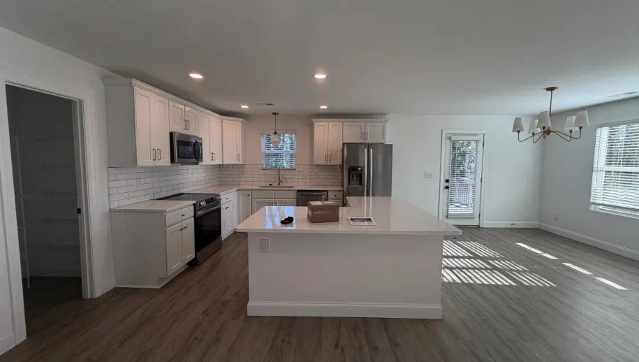
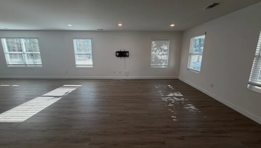
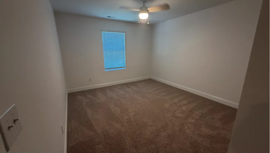
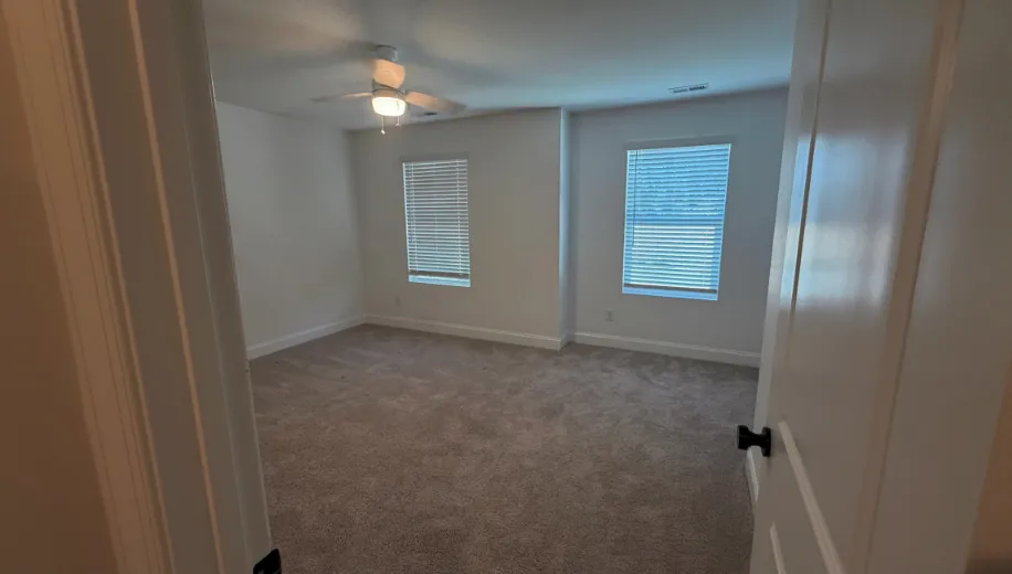
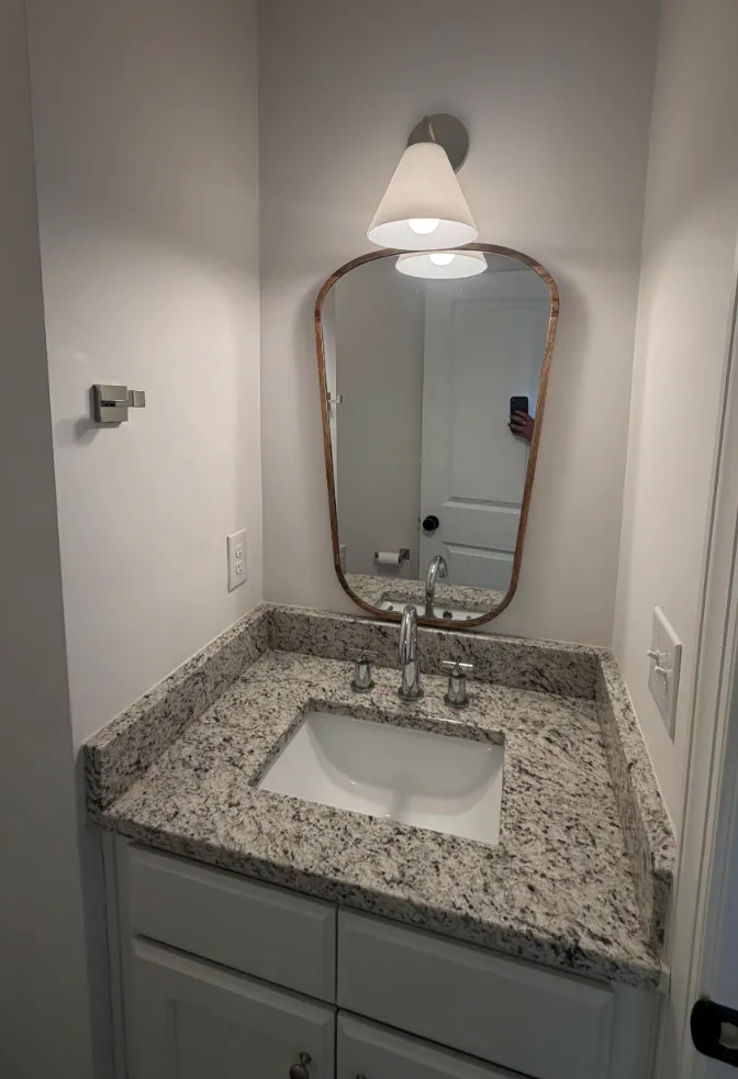
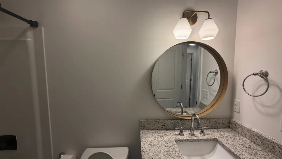
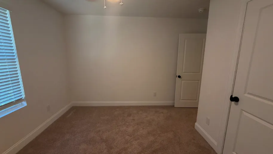
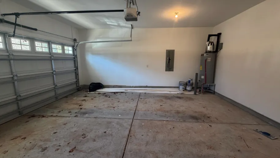 White walls, beige carpet, grey laminate, white cabinets, stainless appliances, granite countertops. Nothing wrong with any of it. Every house in the subdivision looks this way because new-construction finish defaults to "could be anywhere." That's the trap.
On an AirBnB search results page, "could be anywhere" is the difference between scrolling past and clicking through. Listing thumbnails compete on visual contrast first and price second. A bedroom photo of beige carpet against a white wall reads as "fine" in two-tenths of a second, and two-tenths of a second is all you get. The math from Part 2 said the area supports $450-500/night. The thumbnails are what determine whether you book those nights.
The first decision: who's the guest?
The most common failure mode in short-term rentals is treating the property as a vacation home that happens to generate income. The owner picks finishes she'd want for herself, fills the place with her own taste, and is surprised when the nightly rate doesn't show up. It feels personal because the property is hers. The math doesn't care. (We've watched this pattern play out on more than one client deal, and it never ends well for the comp.) Once a property starts generating income, it's a business with one product: the guest experience. The spec sheet for that product is the guest profile. Everything downstream follows from that, paint color included.
For Property A, the guest profile is specific. East Charlotte sits 10-15 minutes from the venues that pull large groups into the city: Spectrum Center for Hornets games and arena tours, Bojangles Coliseum for CIAA weekends and family shows, Bank of America Stadium for Panthers and Charlotte FC. NoDa and Plaza Midwood, both just west of the property, draw the bachelorette and friend-group weekends that cluster around music and bar corridors. Wedding-party blocks come in through east Charlotte's banquet venues and the airport corridor. Youth-sports tournaments on the Independence Blvd / I-485 ring need beds for traveling families. The unit sleeps 16 to 20 with the bunks and pull-outs counted in, which puts it in a category most listings can't fill. None of these guests are looking for "tasteful neutral." They want a property that can hold a crowd, that photographs as a place worth flying out to, and that has enough going on inside and out that nobody has to leave to find something to do.
The revenue mechanism for a property like this isn't mostly the same family coming back. Most vacation groups chase variety. The lift comes from five-star reviews and word-of-mouth recommendations that move the next group from "scrolling past" to "let me check this one." Some repeat booking shows up around recurring events (a wedding season, a youth-sports tournament that comes back yearly), but it's a bonus, not the model. Bland walls don't produce the reviews that climb the algorithm. That's the part of the math the spreadsheet doesn't show.
The design palette
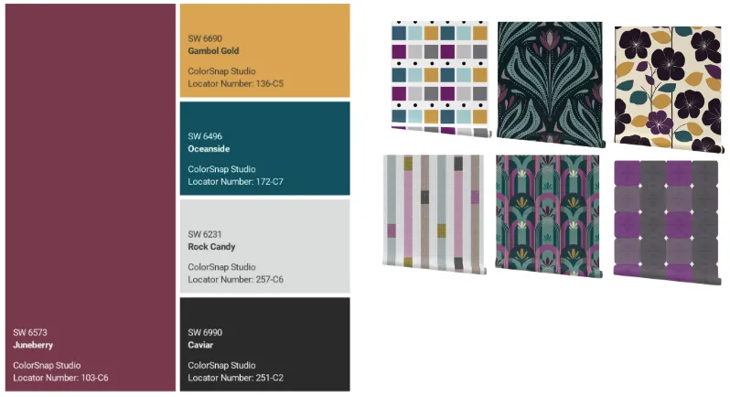
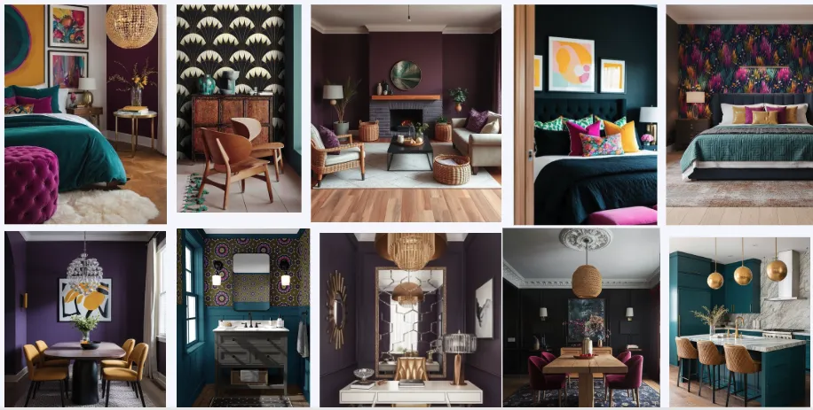
 Five colors. Sherwin-Williams Juneberry (deep wine), Gambol Gold (mustard), Oceanside (deep teal), Rock Candy (light grey), and Caviar (near-black). The mood board leans art-deco and art-nouveau, with bold wallpapers and velvet upholstery doing visual work that paint alone can't.
We tried two other directions before this one. The first was a sage-and-terracotta palette, which the designer flagged early as having the same problem as everything else on the AirBnB search page. The second pulled too dark and lost the windows. The Juneberry-and-teal direction came after we walked the floor plan room by room with the designer and asked which color story each room could carry without fighting the room next to it.
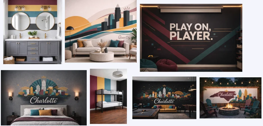
Murals went through a similar exploration. The collage above shows the concepts we tested: a few Charlotte skyline variants, an outdoor wall mural that photographed beautifully but wouldn't survive several seasons against the weather, and the "PLAY ON, PLAYER" game-room piece we ultimately commissioned. Hand-painted murals run a few thousand dollars each, so the question wasn't which concepts we liked. It was which single one was worth the line item on the budget. The game-room mural won because the room is the property's signature differentiator on the listing. The same design vocabulary carried into a secondary bathroom through a simpler painted stripe pattern that didn't require the full mural budget.
The 2026 short-term-rental aesthetic is overwhelmingly safe. Sage green, oat walls, blonde wood, terracotta accents. It photographs well, sells the listing on calm, and looks like every other listing on the page. That's the bet the rest of the market is making.
The bet for Property A is the opposite. Saturated jewel tones in 2026 are contrarian, and contrarian is what makes a thumbnail stop a scroll. A guest searching for a Charlotte weekend who has scrolled past twelve identical oat-and-wood living rooms remembers the teal one.
That doesn't work for every market. It works here because the guest profile is family-and-friend-group travel, where the booker is choosing a property the group will gather around, not a hotel substitute. Our designer made the case for personality over the neutral palette every other listing was using, and we backed her. The neutral aesthetic competes for the business-traveler stay, which is a different listing in a different market. Property A isn't competing for that booking.
Room by room
The rule for the interior is that every room uses the same five-color palette and no two rooms repeat. Five colors give us the discipline; the room-by-room execution is where we get to play. The result reads as deliberate rather than as a Pinterest board with too many tabs open. Start with the living and dining area. The architecture is open-concept, which means it photographs as one continuous shot.
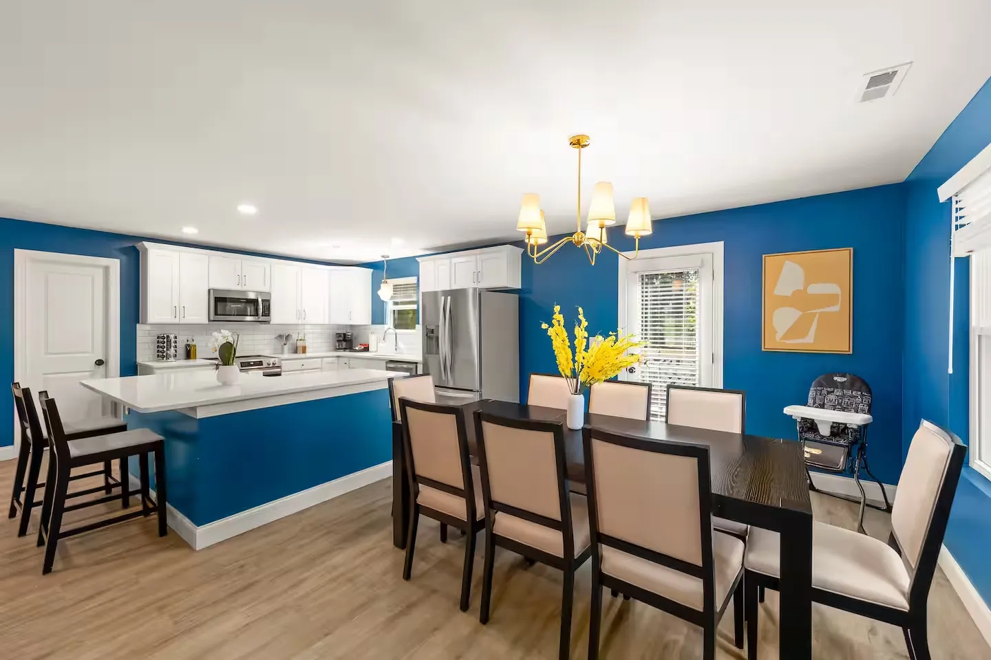
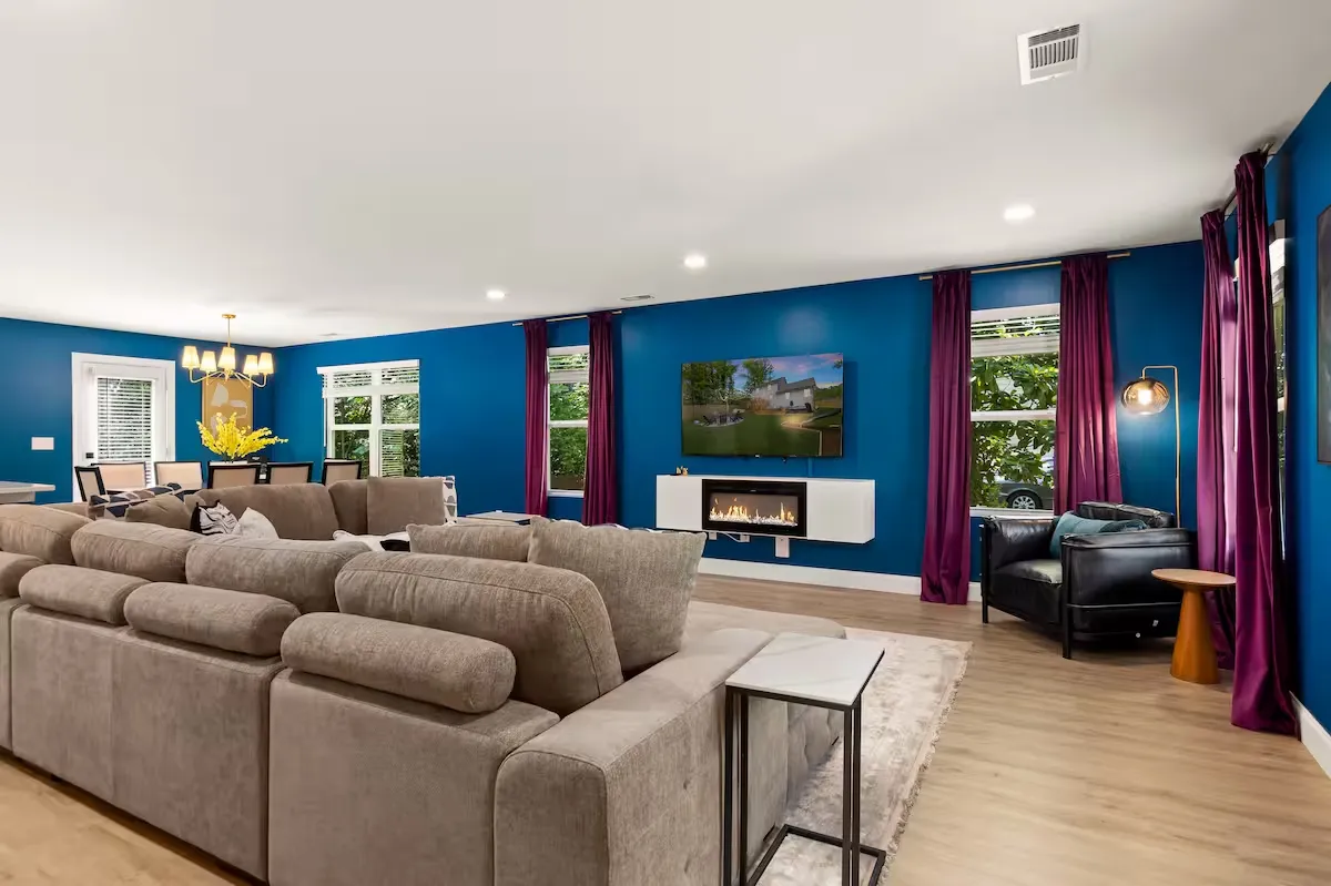 Teal wall holding the open kitchen, deep wine velvet curtains pulling the eye across to the living side, brass chandelier picking up the gold accents on the dining table. The grey velvet sectional is Rock Candy taking up the largest piece of upholstery in the house, which keeps the saturation from overwhelming. The Eames-style accent chair pulls Caviar into the lounge zone.
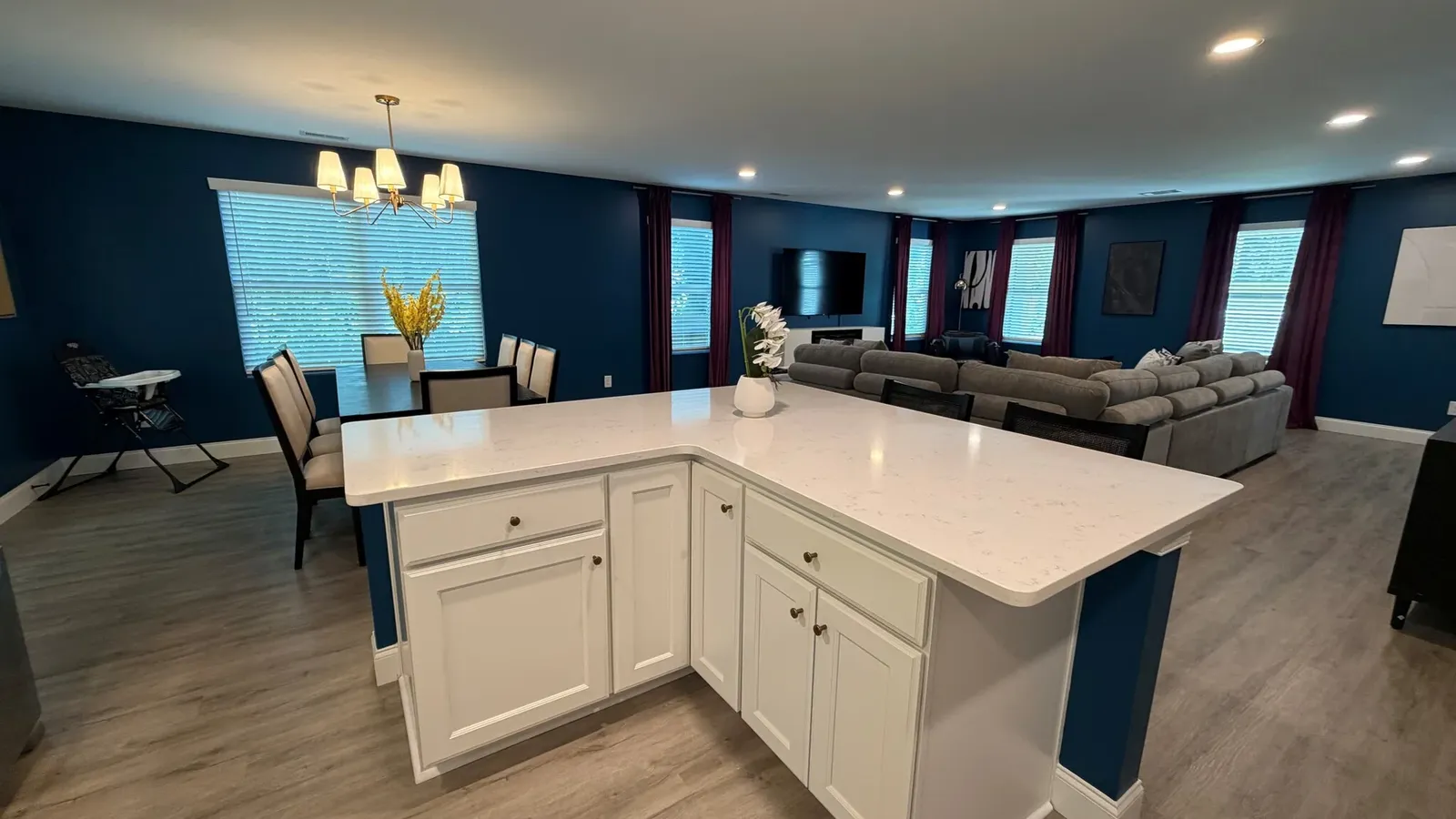
A quick note on what the photos show. That teal reads more azure on the page than the actual paint does. STR listing photographers boost saturation and cool the white balance to compete in the search-results scroll, which crushes Oceanside's green undertone and pushes it toward pure blue. That processing is intentional, and the professional photographer is its own budget line item: how the property photographs is half of how the property books. Here's how the same room reads under natural lighting:
The bedrooms each get a single-color identity. Same palette, no overlap.
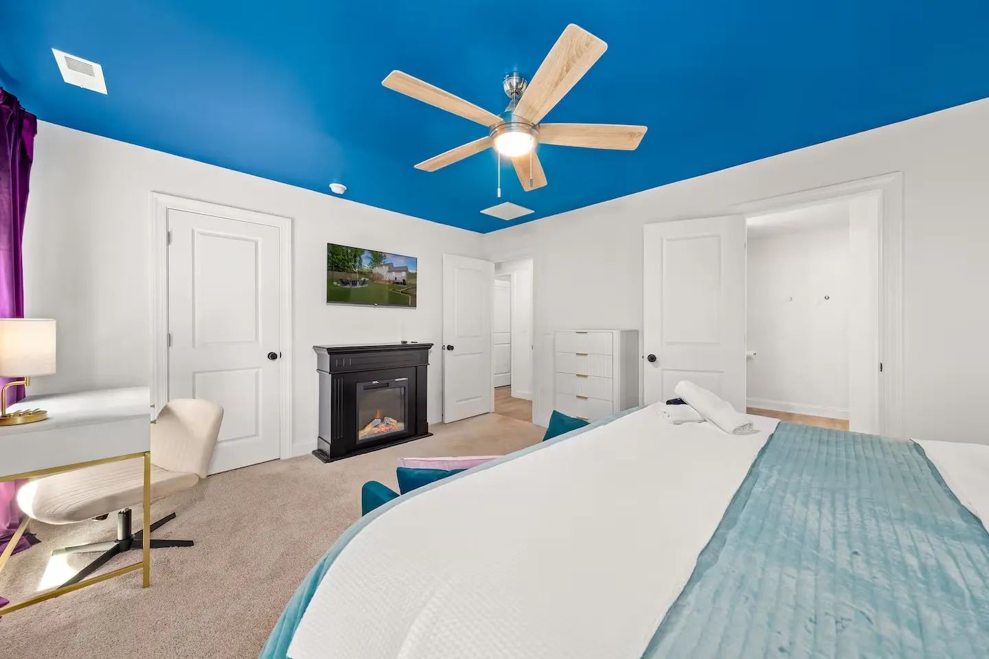
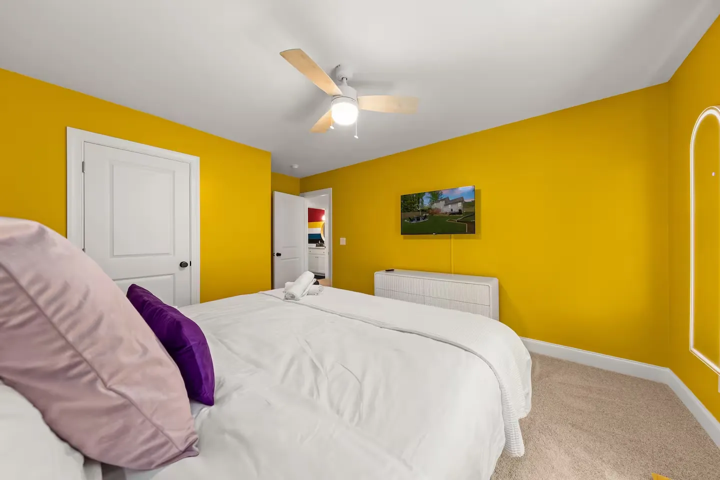
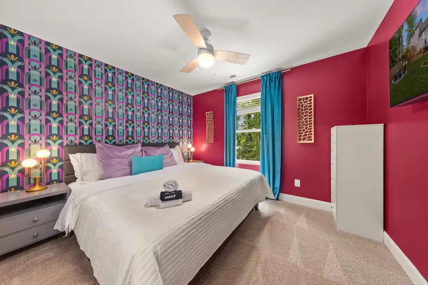
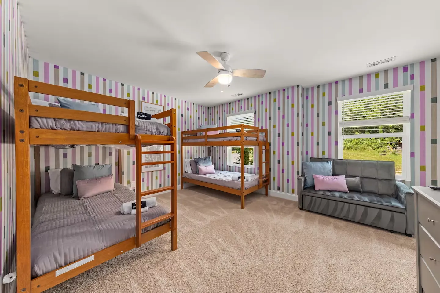 The teal-ceiling room inverts the rule: rather than painting walls saturated, it puts the color overhead and lets the white walls and electric fireplace carry the room. The Gambol Gold yellow room is the loudest single color in the house, paired with Charlotte skyline art that lets the wall stand on its own. The pink room is a near-magenta with a bold mod wallpaper accent and teal drapes. The bunk room runs vertical multicolor stripes, two bunk sets, and a small sofa, which is how the property gets to the headcount that fills it.
The bathrooms get treated by traffic. The powder bath off the main floor is the most-photographed bathroom in any short-term rental because it's the one all guests see. So it earned a bold mod hexagon wallpaper, the same granite vanity that came with the house, and a brass mirror that pulls the palette together.
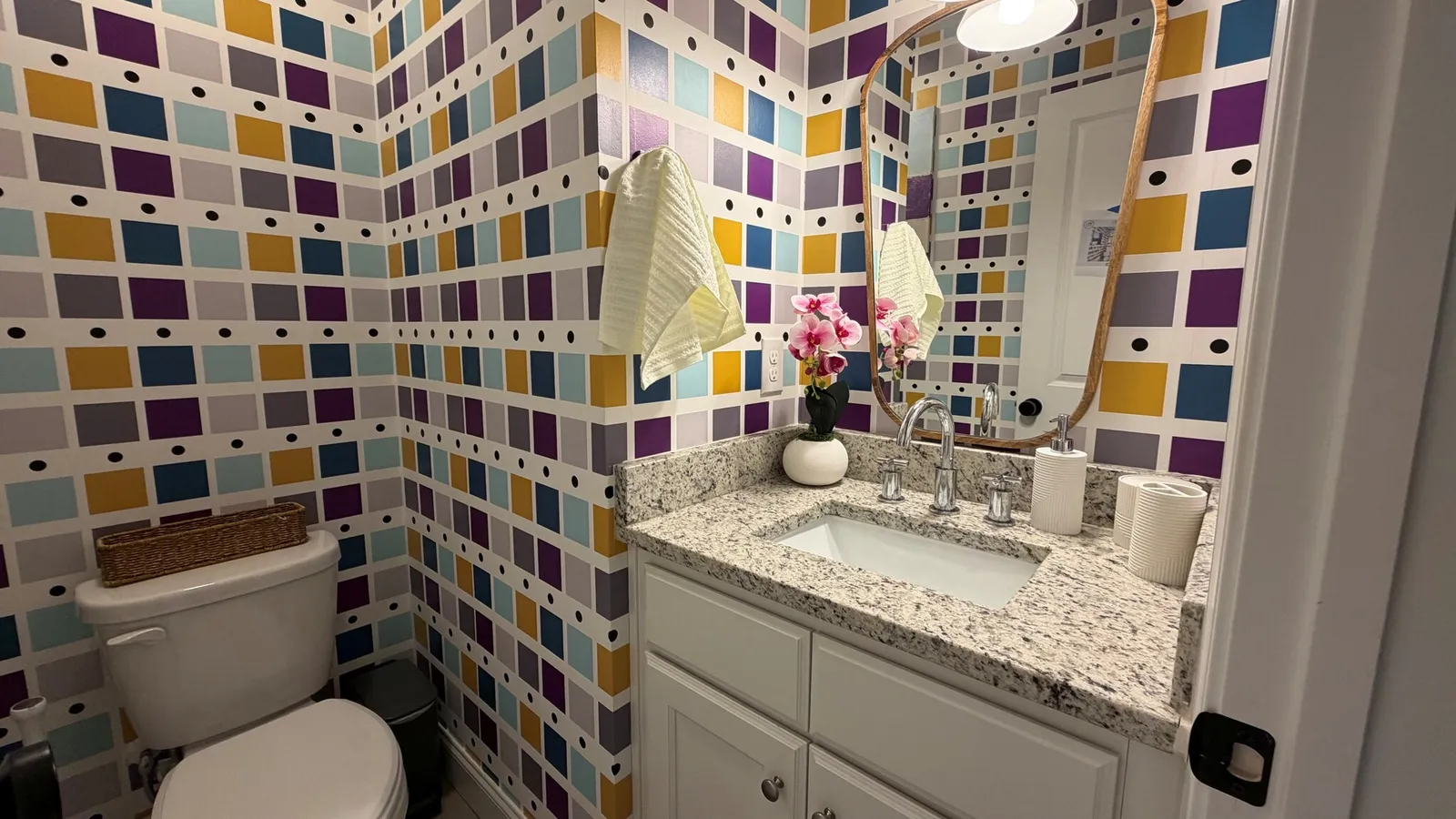 The secondary bath upstairs sits at a middle-tier traffic level: high enough to be worth designing, not the showpiece. The mirror, vanity, and sconce were already in place from the builder, so the only work was the striped painted pattern from the mural exploration on the back wall. The existing round gold-framed mirror suddenly had a backdrop worth photographing.
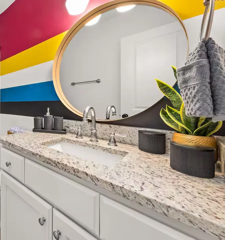 The master bath got a light touch.
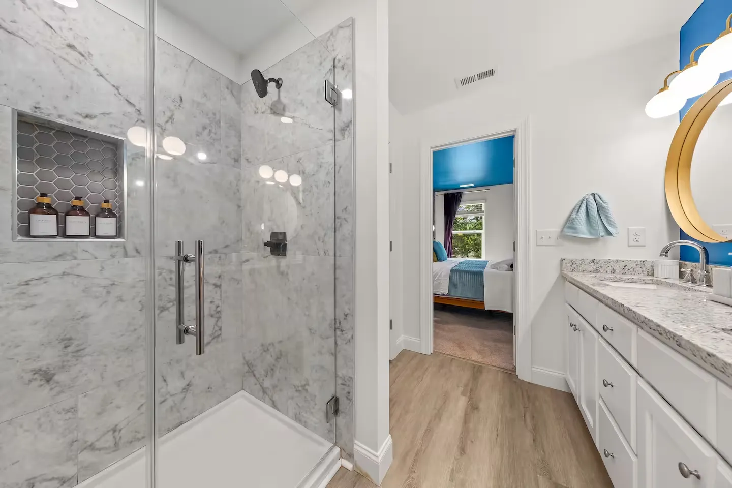 White marble, glass shower, granite vanity, neutral fixtures from the builder, plus one blue accent wall behind the mirror to keep the palette present without overdoing it. This was a deliberate choice. Walking out, the teal-and-yellow bedroom past the door reads as a payoff because there is a quiet room between the eye and the color. Color in every single room exhausts the eye, and the bedrooms wouldn't read as bedrooms if the bathroom between them was also fighting for attention.
The garage build-out
The garage was the room nobody else would have used. Most short-term rentals leave the garage as storage or seal it off so guests can't get in. Both moves waste roughly 400 square feet of soundproofed, structurally separate space that's already on the property. Our designer flagged it early as the highest-leverage room in the house if we were willing to build it out.
Garages aren't climate-controlled, though, so we had our team install a minisplit before anything else got delivered. That single line item is what makes the room work in Charlotte summers and again in January, when families using the house for school breaks would otherwise abandon the space.
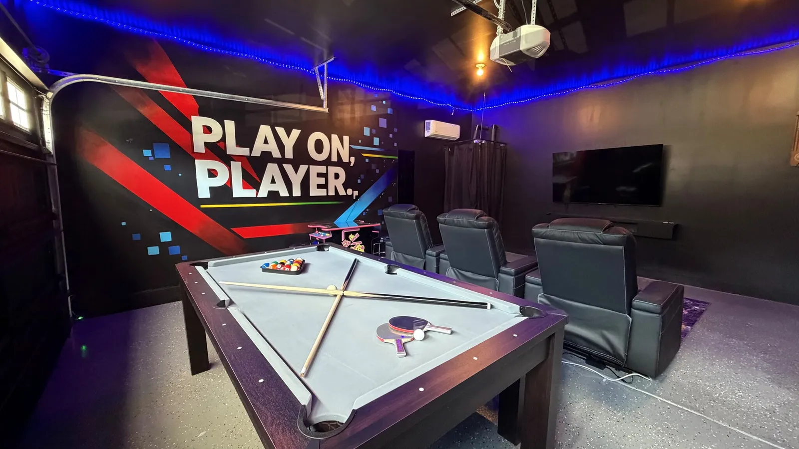 Black walls, LED strip lighting around the ceiling perimeter, a wall mural that gives the room its name. A pool table that converts to ping pong, four theater-style recliners, a mounted television, and enough floor for groups to spread out. We discussed a home gym option with the designer in the same conversation; we both landed on the game room because gyms close at midnight and a family group isn't booking the property for the workout.
The lighting is the one piece we plan to revisit. The original mural concepts had built-in lighting integrated into the wall, which gives the design a more polished, finished-room feel. What's there now is LED strip lighting around the ceiling perimeter, which gets the same color washes and reads well in photos, but it's closer to dressed-up Christmas lighting than the integrated install we want long-term. The decision was to ship the property to market on schedule and upgrade the lighting between guest cycles rather than delay the launch for a single line item.
Bedrooms get nice review comments. A game room gets called out by name in reviews and in the listing title.
The backyard
In Part 1 I noted that Property A's tract has nothing destination-tier inside it; the thesis runs on hotspot adjacency and the redevelopment corridor, not on tourism POIs inside the tract itself. Which means the property itself has to be what guests fly out for. The backyard does most of that work.
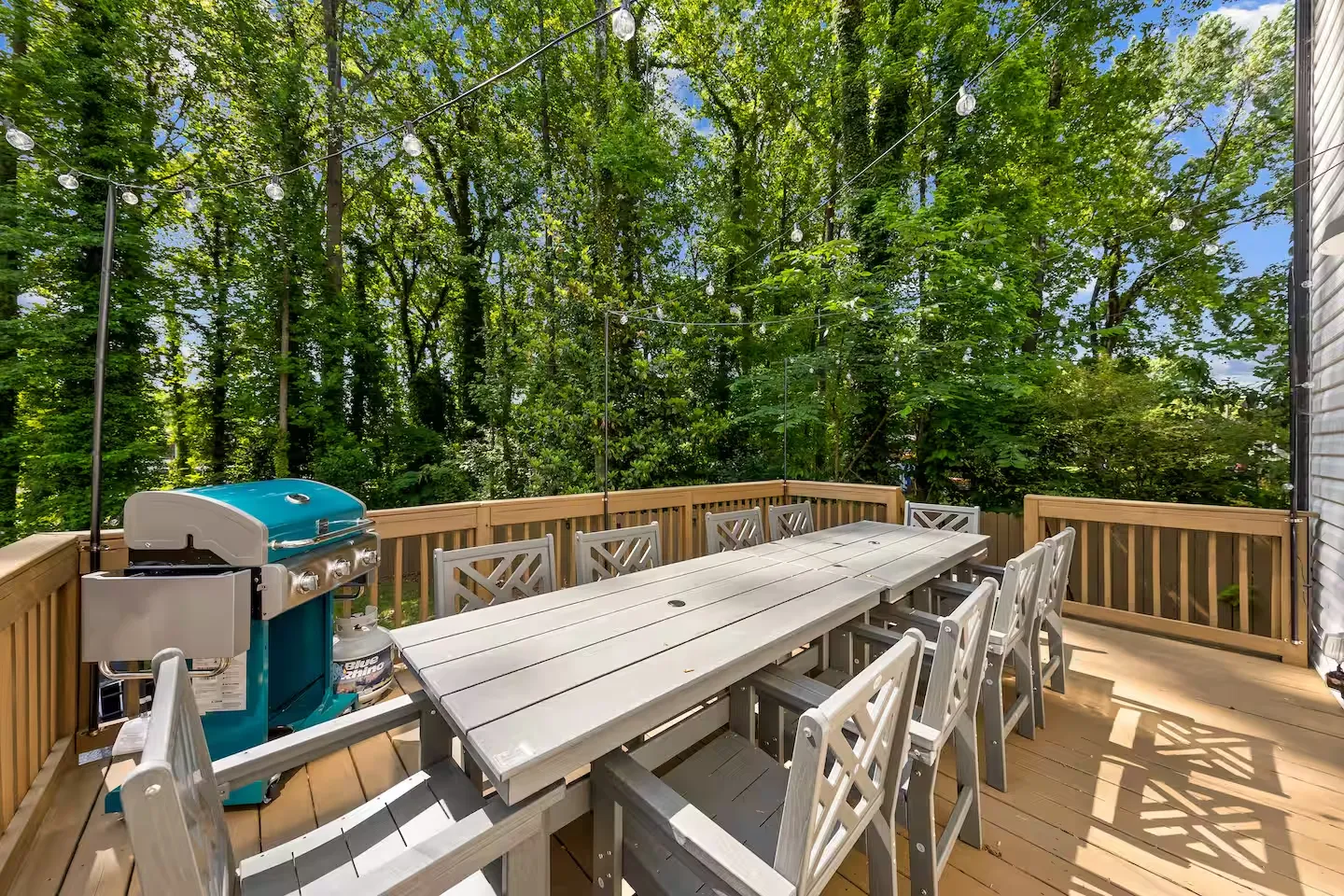
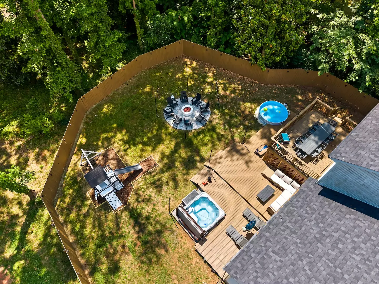
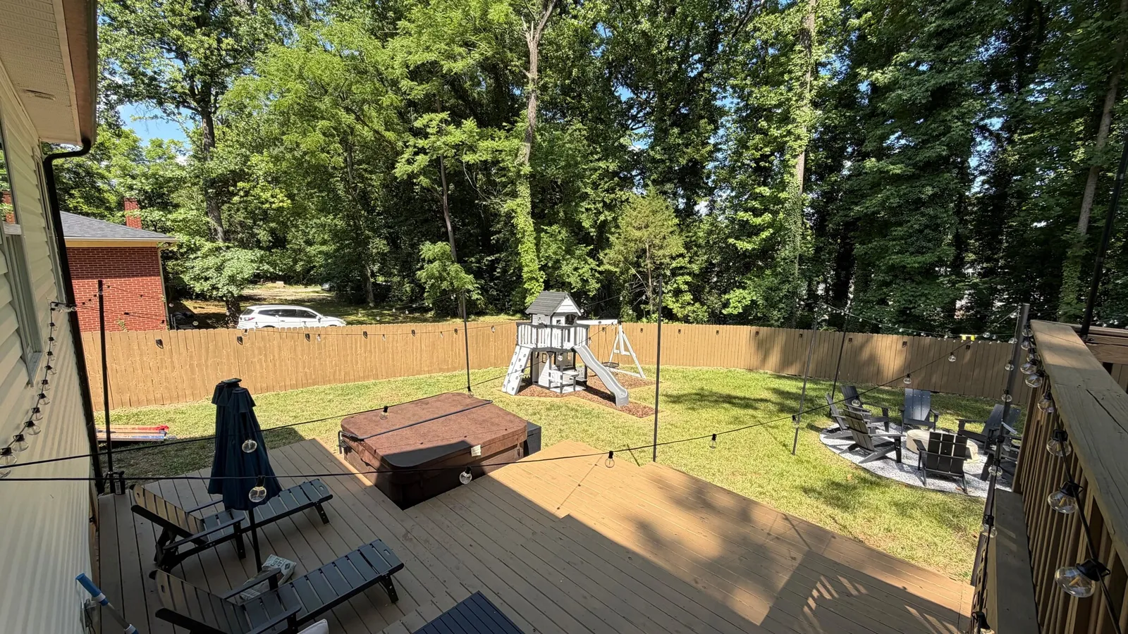 A 7-person hot tub. A fire pit with circular seating for ten. A two-story playground set. An outdoor dining table that seats twelve under string lights. A grill station. Lounge seating along the deck rail. Each piece does a different job for a different subgroup of the household: the kids on the playground, the grandparents at the fire pit, the parents at the hot tub, everyone at dinner.
This is what a multi-generational family group is choosing the property for. Not all of these pieces are cheap (the renovation came to roughly six figures all in), but few of them are individually expensive in the way a kitchen gut or a foundation repair is. The investment is the aerial photograph, because the aerial is what justifies the nightly rate to a guest scrolling listings. A guest scrolling listings sees the shot and stops to read the description. The first weekend the listing fills at full rate, most of that line item has paid for itself.
Cost and tax treatment
Walking through the photos can make this look like a cheap reskin. It wasn't. The full renovation, from the minisplit in the garage to the deck build and the back-yard installs, came in around six figures. For an owner used to thinking in unit prices ($800 sofa, $4000 hot tub), the total can read as alarming.
Two things change the math. The first is the designer. We pay our designer because the alternative is paying twice: once for the choices that don't photograph, and again to redo them when the listing underperforms. A good designer's fee is the cheapest insurance you can buy against a six-figure budget going to the wrong places.
The second is a cost-segregation study. Short-term rental property owned in an LLC can typically accelerate depreciation on a meaningful share of these renovation costs in year one through a cost-segregation analysis, which converts what would have been straight-line write-offs over 27.5 years into a chunk of bonus depreciation against active rental income. We're not tax advisors and the numbers depend on the owner's specific situation, but for a property like this it usually means the IRS gives a meaningful chunk of the renovation budget back inside the first tax year.
AirBnB renovation costs real money. The designer-plus-cost-seg combination recaptures most of it inside the first tax year, and the lift in nightly rate compounds from there. Owners who skip the design step usually find this out by watching a neighbor's listing book at full rate while theirs sits open every other weekend.
Where we didn't spend
Four decisions on what NOT to do shaped the budget as much as the design choices did.
We didn't follow the safe aesthetic. The reason most short-term rentals look the same is that taste-neutral finishes feel low-risk to the owner. They are. They also forfeit the click-through. The market for "tasteful neutral" is saturated; the market for "Charlotte property with a moody dining room and a yellow bedroom" is not.
We kept the master bath intentionally minimal. The granite vanity and builder-spec marble shower stayed, and the only addition was a single blue accent wall behind the mirror. Guests sleeping in the master are happy; the photograph of the master bath isn't going to win anyone a booking, and the budget went to rooms that would.
We didn't try to make every room match. Five rooms, five color stories. Visual variety on the listing page beats internal coherence the guest won't notice until they walk in.
We didn't put the budget where guests don't photograph. The standard granite vanities stayed. The builder-grade laundry room stayed. The garage got transformed. If guests wouldn't photograph it, we didn't spend on it.
The general principle behind all four is who the property is for. The owner sleeps in this house zero nights a year. The guest spends three to seven nights at a time. The renovation budget belongs to whichever of those two has the bigger impact on the nightly rate, and it isn't the owner.
Beyond the renovation
The renovation is the floor. The guest-experience layer sits on top of it: stocking, welcome touches, the small operational moves that turn a 4.5-star review into a 5-star one. We keep most of it out of public writeups because the specifics change per property and per season, and because it's the part competitors copy first.
A putting green on the side yard, a s'mores kit by the fire pit, a kids' breakfast set out the night before: these cost almost nothing and show up in the post-stay reviews directly. The reviews are what move the listing up the search ranking for the next group.
The property opened to bookings in early 2026. Part 4 will check back at the six-month mark with the numbers that matter: occupancy rate, average nightly rate against the AirDNA comp, review breakdown, and the operational issues we ran into. Different market, different client, different bet: the renovation chapter for the next case study will look nothing like this one.
One more piece of the concierge model worth naming. We pair new investors with an established AirBnB superhost as a co-host, so the property launches with that superhost's review history attached. Building the same kind of platform reputation independently usually takes years, and the nightly rate during that ramp is the part most owners eat.
The design step is the optional one in our concierge process for a reason. If your numbers pencil with a generic finish, that's the move. If they don't, design is the cheapest piece of leverage left on the table. Investomation is where the data starts.
Want more details on the layout and scope of work? The full property plot plan, floor plan and room-by-room budget breakdown is available for our Professional members.
