How to Use Granularity to Understand Population Trends
 A while ago, I posted about a new feature I added to Investomation: granularity. Granularity allows you to split up the region differently, to obtain better precision of real estate trends in a specific region. This can be especially useful to analyze inner-core cities for factors such as crime, as I already explained in my post on Englewood in Chicago, where quality of the neighborhood varies block by block.
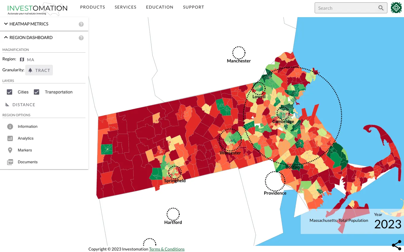
The other use case I stumbled into by accident while researching rural land market (the next investing frontier I'm curently exploring). If you look at the population map with a granulairty of a zip code, it may look like the map below, showing Massachsetts:
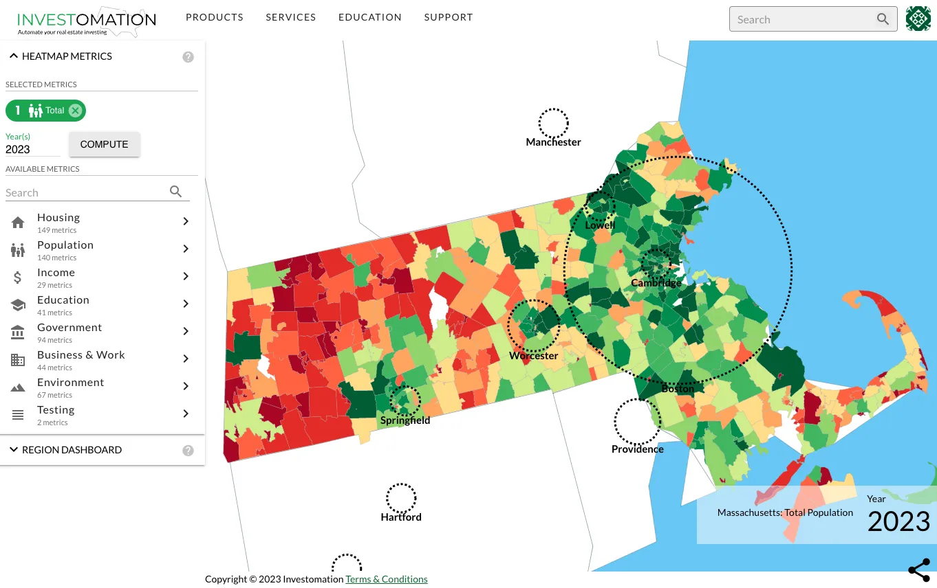
But if you switch the granularity to a census tract, the map starts looking very different. There is a lot more red (low density) than the zip code map seems to show:
At first, this seemed counter-intuitive to me. I thought the predictive engine had a bug in it, but was able to verify that my data aligns with Census data. I then realized that the difference is in how the same data gets organized between a tract and a zip code - effectively the "mean vs median" effect. Census tract is defined as a region with a population of 1,200-8,000 people, with an ideal size of 4,000. Zip codes, on the other hand, are arbitrary areas defined by USPS for delivering mail. Census actually discourages use of zip codes for demographic analysis for this very reason. They have no relation to current demographics aside from corresponding to how many mailmen needed to service the area at the time of USPS formation. Unfortuantely for Census, zipcodes are not going anywhere, they're easier to work with and many business and consumer decisions are based on them. Most of us have no idea which tract we live in, but all of us know our zip code.
In order to understand why the data on the tract map diverges so much from the zip code data, we also need to understand that Census reevaluates tracts every 10 years - during the Decennial Census, splitting them up as needed. The tracts typically follow a predictable pattern, and Investomation tracks these changes. But since Investomation color-codes each area by percentiles, the map will have a lot more high-density tracts in the city rather than in rural regions. However, the zip code sizes will remain mostly unchanged since their inception. This means that a rural area with 1000 residents might still fall within 40th percentile when compared to the relatively few inner-city zip codes with populations over 50k. However, when each of those inner-city zip codes is split into 13 more tracts based on their population, the rural area's rank on the percentile scale will drop significantly. As a result, the tract map makes it easier to see the magnitude of the difference in population between rural and urban areas.
This makes tracts a much better tool for checking population density than a zip code. This also lets you quickly filter out certain areas based on your own investment requirements. A self-storage business, for example, has no chance of succeeding in a major city, with powerful competitors like Public Storage and CubeSmart driving the prices of storage down (while developers and home buyers are driving the prices of land up, squeezing your margins). But in areas 1-2 hours from the city, self-storage facilities thrive, often seeing 8-10% cap rates. Land is the same way, the margins on rural land are much higher than those in the city (of course your buyer pool is also lower). Don't buy based on feel, use math to make better financial decisions.
