Points of Interest: From Pins to Investment Signals
 Before I added Points of Interest to Investomation, checking what's near a property meant toggling between Google Maps, school district websites, transit authority maps, and crime databases. Every source had a different interface, different granularity, and different update schedule. I'd spend twenty minutes just figuring out whether a property was near a university, how far it was from the nearest highway on-ramp, and whether there was a fire station within reasonable response distance. Multiply that by ten properties and the research phase of any deal was eating hours that should have gone into analysis.
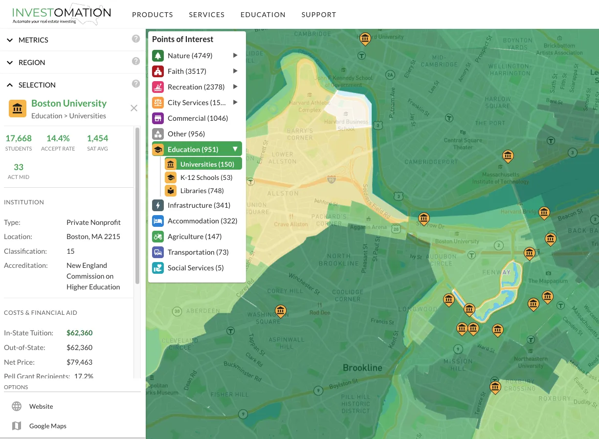
Points of Interest puts all of that on the same map you're already using for market analysis. Thirteen categories with subcategories covering education, city services (fire, police), nature, recreation, transportation, healthcare, and more. Everything that affects whether people want to live somewhere, rendered as a layer on top of your heatmap.
Universities Are More Than Pins on a Map
Most mapping tools will show you that a university exists nearby. Investomation goes deeper. For each university, you get student body size, acceptance rates, SAT/ACT score ranges, tuition figures, and post-graduation earnings data. This turns a generic "there's a college here" into an actual investment thesis.
A 40,000-student campus with low acceptance rates and high tuition means stable demand from families willing to pay for housing. The student body refreshes every four years, creating consistent turnover and predictable occupancy cycles. A small commuter school with declining enrollment is a completely different risk profile. The pin on the map looks the same. The investment case is not.
I've found the post-graduation earnings data particularly useful for evaluating long-term neighborhood trajectories. Universities that produce high-earning graduates tend to anchor neighborhoods that appreciate over time, as alumni stay in the area and former students return after establishing careers elsewhere. This is one of those signals that's invisible on a standard heatmap but becomes obvious when you layer in education POI data.
Distance-Based Analysis
Certain businesses have legally mandated distance requirements from specific types of facilities. Cannabis dispensaries, liquor stores, and adult entertainment venues often must maintain minimum distances from schools, churches, or parks. If you're evaluating a commercial property for one of these uses, you need to know the exact distance to every relevant POI. Instead of measuring this manually on Google Maps (and hoping the measurement is accurate enough for zoning compliance), POIs let you see these spatial relationships directly.
The same principle applies to transit-oriented development. How far is the nearest rail stop, bus hub, or highway interchange? That distance directly affects property values and rental demand. The proximity analysis tools handle the distance calculations under the hood, but POIs provide the reference points.
City Services Tell You About Response Times
Fire stations, police stations, hospitals. These aren't just facilities, they're indicators of emergency response capability. A property that's 2 miles from the nearest fire station has a different insurance profile than one that's 8 miles away. In rural areas, the distance to the nearest hospital can make or break a rental's appeal to families with children or elderly tenants.
Police station density is a proxy for how seriously a municipality takes law enforcement in a given area. It's not a perfect metric (more stations don't automatically mean less crime) but combined with actual crime data from the heatmap, it gives you a more complete picture of public safety infrastructure.
The Franchise Location Question
There's a well-known joke about the best place to open a donut shop being next to a police station. But there's a serious version of this observation. Starbucks density has been used as a gentrification predictor for years. Waffle House locations famously correlate with FEMA disaster response zones. Franchise operators genuinely use demographic and POI clustering to select locations, and they've been doing it long before "data-driven decisions" became a buzzword.
POIs let you run your own version of that analysis. Want to know if there's a gap in coffee shop coverage in a growing neighborhood? Layer the restaurant POIs over population growth data. Want to check if a new transit stop is creating a pocket of unmet retail demand? Layer transit POIs over commercial vacancy data. The combinations are endless, and they're all on the same map.
Parks, Recreation, and the Walkability Premium
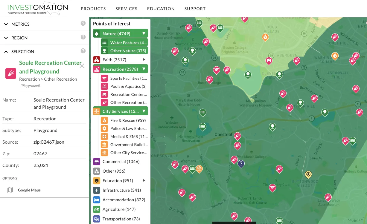 Parks and recreational facilities affect property values more than most investors realize. The National Recreation and Park Association has consistently found that proximity to parks increases residential property values by 8-20%. That premium varies by metro, neighborhood class, and park quality, but the direction is consistent. POIs let you see park coverage as a layer and identify neighborhoods where the premium might be underpriced.
This is especially relevant for B-class neighborhoods where a new park or trail system can be the catalyst that shifts a neighborhood's trajectory. Combine park POIs with the gentrification signals I described in a previous post and you have a more nuanced picture of where neighborhood upgrades are likely to land.
