The Boundaries That Shape Real Estate
 Every piece of land in America belongs to multiple overlapping boundaries: a zip code, a census tract, a county, a school district, a voting precinct. None of them align. Each was created for a different purpose, and using the wrong one leads to wrong conclusions. When I started building analytics tools for real estate investors, I had to make choices about which boundaries to use. The answer wasn't obvious. This post explains the tradeoffs and why we landed where we did.
Zip Codes: The Boundary Everyone Knows
Zip codes were invented in 1963 by the US Postal Service for one purpose: efficient mail delivery. They weren't designed for demographic analysis, economic research, or real estate investment. But they stuck.
Why zip codes dominate:
- Universal recognition. Everyone knows their zip code.
- Easy to remember. Five digits beats "Census Tract 25025081300."
- Data availability. The IRS publishes tax statistics by zip code. Zillow organizes listings by zip code. Most consumer tools default to zip codes.
The problems:
- Zip codes can cross county and even state lines.
- They change when USPS reorganizes mail routes.
- Size varies wildly. A Manhattan zip code covers 20 blocks. A rural Montana zip code covers 100 square miles.
- They're designed for mail trucks, not demographics. One zip code can contain a luxury enclave and a high-crime area.
About 5% of zip codes change annually, though most changes are ZIP+4 extensions rather than core 5-digit codes. In established cities like Boston, zip codes are practically permanent. In fast-growing Sun Belt metros, expect occasional splits as new developments need new codes.
Verdict: Zip codes are convenient for initial research, dangerous for final decisions. They're relatively broad and can easily span half of the city, hiding a lot of the nuance.
Census Tracts: The Boundary Nobody Uses
Census tracts were designed by the Census Bureau specifically for demographic analysis. They target roughly 4,000 residents each, follow visible boundaries like roads and rivers, and aim to capture demographically similar populations.
Why tracts are better for analysis:
- Consistent population size (~1,200-8,000 people, targeting 4,000)
- Boundaries follow natural features, often aligning with real neighborhood boundaries
- Drawn to be internally homogeneous
- Rich demographic data available: income distributions, housing stock age, owner-occupied ratios
Why nobody uses them:
- The naming convention clearly wasn't designed for humans. "Tract 25025010104" means nothing to anyone.
- No consumer tools use them. You won't see tracts on Zillow or Redfin.
- Only city planners, academics, and data professionals know they exist.
The stability problem: Census tracts are redrawn every 10 years. About 18-20% of tracts change each decade. The cruel irony: tracts split in high-growth areas (gentrification) and merge in declining areas (urban decay). The neighborhoods you most want to analyze historically are the ones most likely to have changed boundaries. Comparing "Tract 531500" from 2010 to 2020 may be comparing apples to oranges if it split into 531501 and 531502. The Census Bureau provides relationship files to crosswalk old tracts to new ones, but using them requires work most investors won't do.
Verdict: Tracts are superior for analysis, impractical for everyday use, and require expertise to compare regions across time without making errors.
Counties: The Political Boundary
Counties are colonial-era administrative divisions, some dating to the 1600s. They handle local government, property records, tax collection, and elections.
What counties are good for:
- Very stable. The last new US county was Broomfield, Colorado in 2001.
- Great for understanding regional politics and broad economic trends.
- Property records are organized by county. Deeds, liens, and tax records live at the county level.
What counties are bad for:
- Enormous size variation. Los Angeles County has 10 million people. Loving County, Texas has 64.
- Too large for neighborhood-level decisions. Saying "I'm investing in Middlesex County" tells you almost nothing about specific neighborhoods.
The Connecticut exception: In 2022, the Census Bureau replaced Connecticut's 8 historic counties with 9 "planning regions". The new regions don't map to the old counties, breaking decades of historical data continuity. If you're doing longitudinal analysis in Connecticut, budget extra time.
Verdict: Essential for legal and tax research, too coarse for investment decisions below the regional level.
School Districts: The Hidden Driver
School districts were created for education governance, but they drive residential real estate more than any other boundary. Parents choose homes by school district. This is the open secret of residential investing.
The problem: School district boundaries don't align with anything else. Not zip codes, not census tracts, not counties. A single street can have different school districts on each side. Parents often use zip codes as a proxy for school districts and sometimes get it wrong.
There are roughly 13,000-20,000 school districts nationally, depending on how you count. They're updated annually, with occasional consolidations (especially in rural areas) and contentious boundary changes.
The verdict: Critical for residential property values, but verify directly with the district. Never assume zip code equals school district.
Voting Districts: The Gerrymandered Mess
Voting precincts are the finest-grained political boundary, with roughly 177,000 nationwide. Congressional districts (435 total) and state legislative districts (~7,400 total) are redrawn every 10 years after the census. Mid-decade changes were historically rare, but court-ordered redistricting has become more common.
How people actually think: Nobody says "I live in Congressional District 7." People think in counties for elections. Voting districts matter for political representation but not for daily life or real estate decisions.
The verdict: Politically important, practically irrelevant for real estate analysis.
The Scale Comparison
| Boundary | Count | Avg Population | Best For |
|---|---|---|---|
| States | 50 | 6.6 million | Regulatory/tax environment |
| Counties | ~3,100 | ~107,000 | Regional trends, property records |
| Zip Codes | ~41,500 | ~8,000 | Initial research, communication |
| School Districts | ~13,000-20,000 | ~15,000-25,000 | Residential value drivers |
| Census Tracts | ~85,000 | ~4,000 | Demographic deep-dives |
| Voting Precincts | ~177,000 | ~1,100 | Political analysis only |
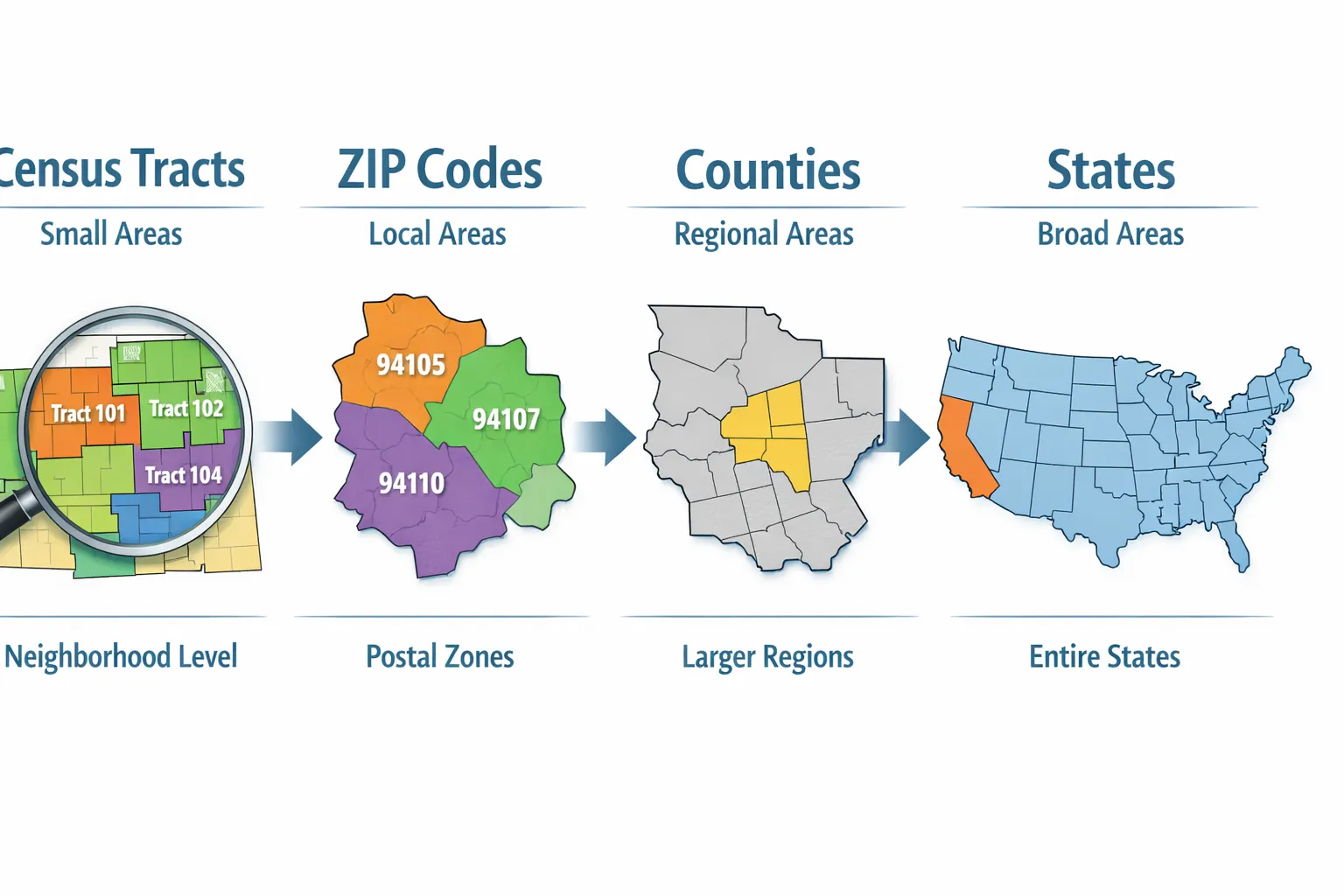
Why We Built Around Tracts, Zips, Counties, and States
 When building Investomation's analytics platform, we had to choose which boundaries to support. Here's our reasoning:
Census tracts are our foundation for neighborhood-level analysis. Yes, the names are ugly. Yes, most people don't know them. But tracts are the lowest level where you can consistently get demographic data across decades. Block groups and blocks exist, but data availability is spotty and changes are even more frequent. Tracts hit the sweet spot of granularity and data reliability. Where possible, we try to provide each tract a human-readable name (usually tied to the closest colloquial town).
Zip codes are our user-facing layer. When you search for an area, you probably know the zip code. We translate that to the underlying tracts for analysis, then present results in terms you understand.
Counties provide regional context. When you zoom out on our maps, county-level aggregations show you the landscape: which areas are growing, which are declining, where the money is flowing.
States frame the regulatory environment. Property tax rules, landlord-tenant law, and licensing requirements vary by state. State-level views help investors understand the playing field.
We deliberately excluded school districts and voting precincts. School districts matter, but the boundaries are a mess and the data isn't demographic. Voting precincts are too granular and too politically volatile.
The Crosswalk Problem (And How We Solved It)
The dirty secret of longitudinal real estate analysis: boundaries change, and most data sources don't account for it. When you compare a tract's median income in 2010 to 2020, you might be comparing different geographic areas if the tract split or merged.
We've incorporated the Census Bureau's crosswalk files into our platform. When you look at historical trends on Investomation, we've already done the work of mapping old boundaries to new ones. A tract that split in 2020 shows you the combined historical data for both successor tracts. A tract that merged shows you the aggregated predecessor data. This isn't glamorous work. It doesn't make for exciting feature announcements. But it's the difference between analysis you can trust and analysis that misleads you.
Which Boundary to Use When
| Task | Use This | Why |
|---|---|---|
| Initial area filtering | Zip code | Familiar, easy to communicate |
| Deep demographic analysis | Census tract | Designed for this purpose |
| Property tax/legal research | County | That's where records live |
| Residential investment | School district + tract | Schools drive value, tracts show demographics |
| Regional trend analysis | County | Right level of aggregation |
| Understanding state landscape | County map | Shows political and economic variation |
The boundaries that shape real estate weren't designed for real estate. They were designed for mail delivery, census counting, political representation, and school administration. Understanding their origins, limitations, and overlaps is the first step toward using them correctly.
For tract-level analytics with built-in crosswalk handling, check out our map tools.
