Timeline
While using the Investomation map, you may have noticed a number in the bottom right corner corresponding to the current year. This year can be changed by clicking on it, which will open up the timeline.
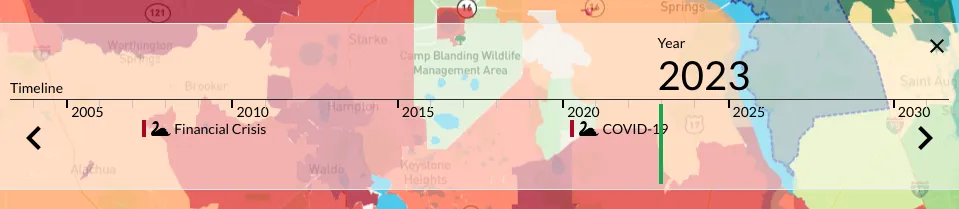
The green slider on the timeline corresponds to the selected year and moving it around will automatically update the heatmap. This can be useful to examine how neighborhoods changed over time. Is the area turning more green (desirable) or is it becoming more red as you move the slider forward?
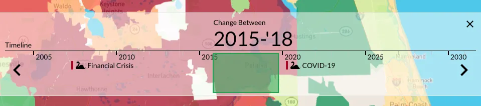
As you hover over the slider, you may also notice 2 arrows appear on the sides. These arrows let you change the slider size, effectivelly selecting a slice in time instead of a snapshot of a specific year. This slice corresponds to the delta/change between two years.
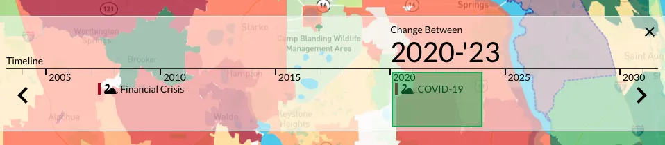
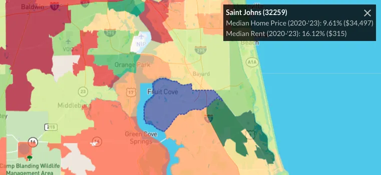
In this example we're looking at a delta of 3, which means that we're comparing the current year values against those from 3 years ago to see how each zipcode scored in terms of percent change. Clicking on a zip code would then open up a pop up in the top right corner showing how each of the selected metrics (in this case Median Home Price and Median Rent) changed over the last 3 years.
Please note that most of the data that comes from official sources (Census, FBI, IRS, NOAA, etc.) takes a while to get published, often up to 2 years. For that reason, up-to-date data is an estimate based on our internal analaysis of the trends. For that reason, the full impact of COVID-19 may not yet be visible. Sales trend data that we collect from sources like Redfin gets updated monthly and is more accurate.
Just like the regular slider, the delta version of the slider can be moved around as well to sample percent change over a different timeframe, effectivelly showing you if the trend is accelerating or reversing.
For now we've deprioritized further timeline development in favor of other features, but we plan to add the following features by the end of 2024:
- Timeline showing when your markers were created/sold/purchased (to learn more about markers, read this blog post)
- Timeline showing yield curve
- Timeline allowing minimum granularity of a month instead of a year
If your use case involves analyzing regional changes over time, you may also be interested in more recently added feature called Delta Metrics, which can be used to measure change of individual metrics rather than all metrics at once.
